Introduction to Color Psychology in Home Decor
Colors are powerful tools in interior design. They do not just beautify your home; they shape your experiences within it. From calming blues to energizing reds, the shades you choose can influence mood, productivity, relationships, and even sleep quality. Understanding color psychology in home decor enables you to harness the impact of colors in interiors, creating spaces that feel comfortable, balanced, and emotionally supportive.
In home decor, understanding color psychology allows you to:
- Create a welcoming atmosphere.
- Boost comfort and relaxation.
- Encourage productivity or creativity.
- Reflect your personal style.
Whether you are redesigning a single room or your entire home, mindful use of color based on color psychology in home decor can transform ordinary interiors into spaces that nurture your lifestyle and well-being.
Why Color Psychology Matters in Interior Design?
Colors impact us in both subtle and powerful ways. When chosen thoughtfully, they can:
- Affect mood and emotions: Warm hues like red and yellow stimulate energy, while cool tones like blue and green calm the mind.
- Influence behavior: Certain shades encourage appetite (yellow and red), focus (blue), or creativity (orange and purple).
- Change the perception of space: Light shades make rooms appear larger and airier, while dark shades make them feel cozier and more intimate.
- Express personality: Bold colors often indicate confidence, while muted neutrals suggest calmness and simplicity.
Interior designers often say that choosing a color palette is like setting the “emotional tone” of your home. When aligned with the principles of color psychology in home decor, the right color scheme can turn your home into a functional yet emotionally supportive space.
Color Psychology in Home Decor
When it comes to color psychology in home decor, each hue has a unique way of influencing mood, energy, and the overall atmosphere of a room. Let us explore how different colors can transform your living spaces, starting with red.
1. Red: Passion and Energy
Red is a dynamic, attention-grabbing color often associated with excitement, love, and passion. It raises energy levels, stimulates conversation, and can even increase appetite, which is why many restaurants use it in their decor.
- How it feels: Energizing, passionate, stimulating.
- Design tips: Use red sparingly, think accent walls, cushions, or artwork. Too much red can feel aggressive or overwhelming. Deep reds, such as burgundy or maroon, create a more sophisticated look.
- Best for: Dining rooms (to encourage appetite), living rooms (to spark conversation), and entryways (to make a bold first impression).
2. Orange: Warmth and Sociability
Orange is a cheerful and lively color, symbolizing enthusiasm and friendliness. It combines the warmth of red with the brightness of yellow, making spaces feel welcoming and upbeat.
- How it feels: Inviting, sociable, energetic.
- Design tips: Great for accent walls or decor items like rugs, lamps, and cushions. For a modern twist, pair burnt orange with neutrals like beige or gray.
- Best for: Living rooms, playrooms, or exercise spaces where energy and interaction are encouraged.
3. Yellow: Optimism and Joy
Yellow radiates happiness and positivity, often linked with sunlight and warmth. It creates a cheerful atmosphere and can boost creativity and focus.
- How it feels: Uplifting, sunny, joyful.
- Design tips: Use soft, pastel yellows in bedrooms or kitchens for a subtle touch. Use bright yellows in small doses, such as wall art or accent furniture.
- Best for: Kitchens (to stimulate appetite), breakfast nooks (to start the day with positivity), and home offices (to encourage creativity).
4. Green: Balance and Harmony
Green is the most restful color for the eyes. It is associated with nature, renewal, and balance, making it ideal for creating peaceful spaces.
- How it feels: Calming, refreshing, grounding.
- Design tips: Soft sage greens are a trendy choice in modern homes, while emerald green adds a touch of luxury. Add indoor plants to complement green decor and enhance the natural vibe.
- Best for: Bedrooms (to promote rest), bathrooms (to create a spa-like feel), and living rooms (to balance energy).
5. Blue: Calm and Tranquility
Blue is well-known for creating a sense of peace and relaxation. It lowers stress, slows heart rate, and inspires relaxation. Darker blues feel formal and authoritative, while lighter blues evoke serenity.
- How it feels: Relaxing, stable, peaceful.
- Design tips: Light blues work well in bedrooms or bathrooms, while navy or royal blue adds elegance in living rooms or dining areas. Pair blue with white for a timeless, coastal-inspired look.
- Best for: Bedrooms, bathrooms, and home offices where focus and calm are important.
6. Purple: Luxury and Creativity
People often associate purple with royalty, spirituality, and creativity. It stimulates creativity while also adding sophistication to a space.
- How it feels: Creative, luxurious, mystical.
- Design tips: Light lavenders are ideal for bedrooms or nurseries, while deep purples, such as plum or eggplant, create drama in dining rooms or home libraries.
- Best for: Bedrooms, meditation spaces, or creative studios.
7. Pink: Compassion and Playfulness
Pink is soft, nurturing, and playful. It represents compassion and love, but can also be chic and modern when used strategically.
- How it feels: Romantic, gentle, playful.
- Design tips: Soft blush tones work beautifully with metallics like gold or copper. Hot pink accents can liven up a teenager’s room or modern living space.
- Best for: Nurseries, bedrooms, and contemporary living rooms.
8. Brown: Comfort and Stability
Brown symbolizes grounding, security, and comfort. It brings warmth into spaces and works well in natural, rustic, or earthy decor styles.
- How it feels: Cozy, dependable, safe.
- Design tips: Use brown through natural wood furniture, leather accents, or earthy textiles. To prevent a space from looking too heavy, balance brown with lighter tones.
- Best for: Living rooms, studies, and rustic-style kitchens.
9. White: Simplicity and Purity
White reflects light, creating an airy and open feel. It signifies cleanliness, simplicity, and minimalism.
- How it feels: Fresh, pure, open.
- Design tips: To avoid sterility, add warmth with textured fabrics, wooden accents, or pops of color. White is a great base for Scandinavian or minimalist designs.
- Best for: Small spaces, kitchens, and minimalist-themed rooms.
10. Black: Sophistication and Depth
Black conveys power, elegance, and depth. While overwhelming when overused, it adds drama and contrast when applied strategically.
- How it feels: Bold, sophisticated, grounding.
- Design tips: Incorporate black into furniture, statement walls, or decorative accents for a sophisticated look. Pair with metallics or jewel tones for a luxurious look.
- Best for: Accent walls, modern dining rooms, and high-contrast spaces.
11. Gray: Modern Neutrality
Gray is versatile and calming, often used as a sophisticated neutral. It combines warm and cool tones, making it suitable for many design styles.
- How it feels: Balanced, modern, elegant.
- Design tips: Light grays create airy, contemporary spaces, while darker grays add drama and depth. Combine with bright accent colors to avoid a dull appearance.
- Best for: Living rooms, bedrooms, and professional workspaces.
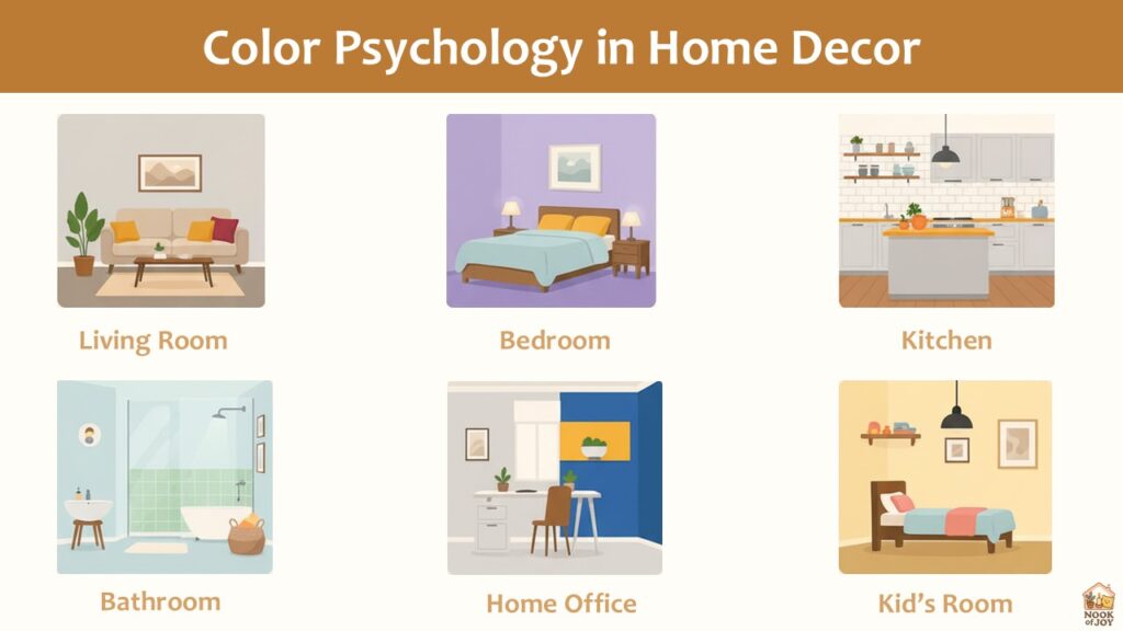
How to Use Color Psychology in Different Rooms?
Living Room
The living room is the heart of the home, a space where socializing and relaxation take place.
- Use warm neutrals, such as beige, taupe, or gray, for a welcoming backdrop.
- Add bold accents like red, orange, or mustard to encourage lively conversations.
- Incorporate greenery or green hues to balance energy and create a sense of harmony.
Bedroom
Your bedroom should promote rest.
- Soft blues, greens, or lavenders reduce stress and improve sleep quality.
- Avoid overly stimulating shades, such as bright red or neon yellow.
- Pair calming colors with warm neutrals for a cozy yet restful environment.
Kitchen
The kitchen is often a space of energy and creativity.
- Yellow and orange tones stimulate appetite and make mornings cheerful.
- White or light gray creates a clean, hygienic feel.
- Add colorful backsplashes or decorative items to add personality.
Bathroom
You can design bathrooms to be calming retreats.
- Blues, greens, and whites give a fresh, spa-like vibe.
- Use soft lighting to enhance the relaxing effect.
- Add accents like pastel tiles or natural materials for texture.
Home Office
Color choices can boost productivity and focus.
- Blue improves concentration, while green reduces stress and eye fatigue.
- A touch of yellow or orange can spark creativity.
- Neutral backdrops paired with bold accents prevent distraction.
Children’s Room
Children’s spaces need to strike a balance between energy and calm.
- Soft yellows, greens, and light blues create cheerful yet soothing environments.
- Use playful accents like pink, orange, or purple in moderation.
- Avoid excessive use of red, which can overstimulate children.
Tips for Applying Color Psychology in Home Decor
- Start small: Experiment with accent pillows, rugs, or artwork before painting entire walls.
- Balance bold with neutral: Mix vibrant shades with calming neutrals for a harmonious look.
- Test lighting: Colors look different in natural vs. artificial light; always test samples.
- Consider room size: Light colors can make small rooms appear larger, while darker shades can add intimacy to larger ones.
- Personalize your palette: Pick colors that match your lifestyle and feelings, not just what is popular in design trends.
Final Thoughts
Color psychology in home decor is more than design; it is about shaping experiences and emotions in the spaces you live in every day. By understanding how each hue influences mood and behavior, you can intentionally create interiors that nurture your mind, body, and soul.
Whether you want your bedroom to be a serene retreat, your living room to feel lively and welcoming, or your home office to boost productivity, the right color palette can make all the difference.
Transform your home with the science of color and design a space that feels not just beautiful but deeply aligned with your lifestyle.
Frequently Asked Questions (FAQs)
Q1. Can color psychology affect mental health at home?
Answer: Yes. Colors can influence mood and emotional well-being. For example, calming shades like blue and green can reduce stress, while bright colors like yellow and orange can uplift your mood and increase energy levels. Choosing colors intentionally can help create a more mentally supportive home environment.
Q2. How do I choose the right colors if my home has limited natural light?
Answer: In spaces with little natural light, lighter shades like soft whites, pastels, and muted neutrals work best. These colors reflect light, making the room feel brighter and more spacious. Adding reflective surfaces or warm artificial lighting can further enhance the effect.
Q3. Can color combinations influence the energy of a room?
Answer: Absolutely. Complementary or harmonious color combinations can create balance and flow, while contrasting colors can energize or create focal points. For instance, pairing blue with soft neutrals promotes a sense of calmness, whereas combining red with yellow energizes a space.
Q4. Are certain colors more suitable for small rooms?
Answer: Yes. Light and cool colors, such as pale blues, greens, and soft grays, can make small spaces feel larger and airier. Dark colors, when used strategically, can add depth or create a cozy, intimate atmosphere without overwhelming the space.